Multiple Choice
The following diagram shows the movement of U.S. households among three income groups - affluent, middle class, and poor - over the 12-year period 1965-1977. Assuming that the trend shown was to continue, what percent of households classified as affluent in 1965 were predicted to become poor in 1989 (Give your answer to the nearest .) According to the model, what percentage of all U.S. households will be in each income bracket in the long term (Give your answer to the nearest percent.) 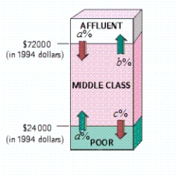 , , ,
, , ,
A) 6% of households classified as affluent in 1965 were predicted to become poor in 1989. In the long term: Affluent: 22.9%; Middle class: 39.1%; Poor: 38.1%
B) 1.8% of households classified as affluent in 1965 were predicted to become poor in 1989. In the long term: Affluent: 30.1%; Middle class: 5.9%; Poor: 64%
C) 6% of households classified as affluent in 1965 were predicted to become poor in 1989. In the long term: Affluent: 30.1%; Middle class: 5.9%; Poor: 64%
D) 0% of households classified as affluent in 1965 were predicted to become poor in 1989. In the long term: Affluent: 30.1%; Middle class: 5.9%; Poor: 64%
E) 0% of households classified as affluent in 1965 were predicted to become poor in 1989. In the long term: Affluent: 15.6%; Middle class: 72.3%; Poor: 12.1%
Correct Answer:

Verified
Correct Answer:
Verified
Q100: A pair of dice is cast,
Q101: A bag contains 4 red marbles,
Q102: Adoptions College instructors who adopt this
Q103: Write down the transition matrix associated
Q104: The following table shows the results
Q106: A 2001 Agriculture Department study of more
Q107: Determine whether the given information is
Q108: Suppose two dice (one green, one
Q109: A bag contains 4 red marbles,
Q110: In the New York State daily lottery