Essay
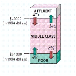
The following diagram shows the movement of U.S. households among three income groups - affluent, middle class, and poor - over the 11-year period 1978-1989.
 ? , , , ?
Use the transitions shown in the diagram to construct a transition matrix (assuming zero probabilities for the transitions between affluent and poor).
Take 1 = Affluent, 2 = Middle class, 3 = Poor.
Assuming that the trend shown was to continue, what percent of households classified as affluent in 1978 were predicted to become poor in 2000 (Give your answer to the nearest 0.1%.)
The answer is __________%
According to the model, what percentage of all U.S. households will be in each income bracket in the long term (Give your answers to the nearest 0.1 percent.)
Percent of affluent is __________%
Percent of middle class is __________%
Percent of poor is __________%
Correct Answer:

Verified
; 2.4; 16....View Answer
Unlock this answer now
Get Access to more Verified Answers free of charge
Correct Answer:
Verified
View Answer
Unlock this answer now
Get Access to more Verified Answers free of charge
Q40: In fall 2003, UCLA admitted 24% of
Q41: If A and B are mutually
Q42: This table shows the results of
Q43: Calculate the estimated probability using the given
Q44: The phrase "Dogs of the Dow"
Q46: The table shows sales in thousands
Q47: Two dice (one red and one green)
Q48: You are deciding on whether to
Q49: Use Bayes' theorem or a tree
Q50: It snows in Greenland an average of