Multiple Choice
Figure 18-1
On the graph, L represents the quantity of labor and Q represents the quantity of output per week. 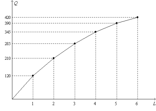
-Refer to Figure 18-1. The figure illustrates the
A) demand for labor.
B) supply of labor.
C) production function.
D) wage function.
Correct Answer:

Verified
Correct Answer:
Verified
Q46: Define monopsony.
Q66: When a firm decides to retain its
Q166: For competitive firms, the curve that represents
Q564: Suppose that Chloe opens a dog grooming
Q565: Consider the labor market for heath care
Q566: Table 18-B<br>Consider the following daily production data
Q570: Figure 18-1. The figure shows the relationship
Q571: An upward-sloping labor supply curve means that<br>A)workers
Q573: The Black Death in fourteenth-century Europe resulted
Q574: Figure 18-1. The figure shows the relationship