Multiple Choice
Figure 10-18. The graph represents a corrective tax to reduce pollution. On the axes, Q denotes the quantity of pollution and P represents the price of pollution. 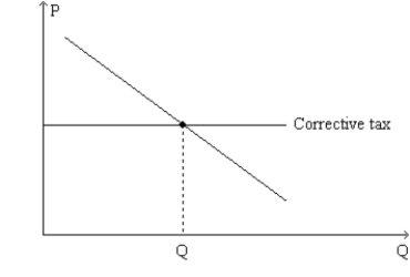
-Refer to Figure 10-18. The tax depicted on the graph
A) gives polluting firms an incentive to develop cleaner technologies.
B) is viewed by most economists as less effective than a command-and-control policy as a means of reducing pollution.
C) has the effect of moving the allocation of resources further from the social optimum than it would be in the absence of the tax.
D) All of the above are correct.
Correct Answer:

Verified
Correct Answer:
Verified
Q79: Figure 10-9 <img src="https://d2lvgg3v3hfg70.cloudfront.net/TB1273/.jpg" alt="Figure 10-9
Q80: Dee loves to landscape her yard, but
Q81: An externality is an example of<br>A)a corrective
Q82: With pollution permits, the supply curve for
Q83: Figure 10-10 <img src="https://d2lvgg3v3hfg70.cloudfront.net/TB1273/.jpg" alt="Figure 10-10
Q85: Internalizing a positive externality will cause the
Q86: Figure 10-10 <img src="https://d2lvgg3v3hfg70.cloudfront.net/TB1273/.jpg" alt="Figure 10-10
Q87: Because there are positive externalities from higher
Q88: Table 10-5<br>The following table shows the marginal
Q89: Technology spillover occurs when<br>A)a firm passes the