Multiple Choice
Figure 9-16.The figure below illustrates a tariff.On the graph,Q represents quantity and P represents price. 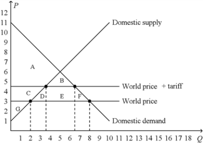
-Refer to Figure 9-16.The deadweight loss created by the tariff is represented by the area
A) B.
B) D + F.
C) D + E + F.
D) B + D + E + F.
Correct Answer:

Verified
Correct Answer:
Verified
Q69: In the market for apples in a
Q70: Figure 9-3.The domestic country is China. <img
Q71: A tariff on a product<br>A)is a direct
Q72: When a country allows trade and becomes
Q73: Figure 9-2<br>The figure illustrates the market for
Q75: Figure 9-23<br>The following diagram shows the domestic
Q76: When a country allows international trade and
Q77: In analyzing international trade,we often focus on
Q78: Scenario 9-2<br>• For a small country called
Q79: Domestic producers of a good become worse