Multiple Choice
Exhibit 19-5
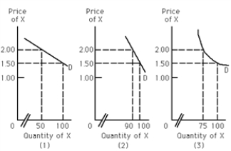
-Refer to Exhibit 19-5. Which of the graphs represents a greater percentage change in quantity demanded than the percentage change in price?
A) (1)
B) (2)
C) (3)
D) (2) and (3)
Correct Answer:

Verified
Correct Answer:
Verified
Related Questions
Q52: If the seller of good X raises
Q53: If the supply curve for good X
Q54: Airlines that try to lower fares in
Q55: Which of the following is true?<br>A)The price
Q56: The shorter the period of time consumers
Q58: If income elasticity of demand for a
Q59: If the demand for a product is
Q60: Price rises from $9.99 to $10.99 and
Q61: If a good is a normal good,
Q62: Suppose that when the price of a