Multiple Choice
Figure 8-8
Graph (a) 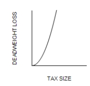
Graph (b) 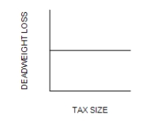
Graph (c) 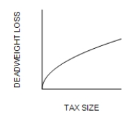
-Refer to Figure 8-8. Which graph correctly illustrates the relationship between the size of a tax and the size of the deadweight loss associated with the tax?
A) Graph (a)
B) Graph (b)
C) Graph (c)
D) Graph (d)
Correct Answer:

Verified
Correct Answer:
Verified
Q13: Provide several examples of important taxes on
Q14: Refer to Scenario 8-3. Suppose that
Q15: Figure 8-10<br><br> <img src="https://d2lvgg3v3hfg70.cloudfront.net/TB7555/.jpg" alt="Figure 8-10
Q16: The demand for energy drinks is more
Q17: Figure 8-3<br>The vertical distance between points A
Q19: Taxes drive a wedge into the market
Q20: Taxes on labor tend to increase the
Q21: The Social Security tax is a tax
Q22: Figure 8-12<br><img src="https://d2lvgg3v3hfg70.cloudfront.net/TB7555/.jpg" alt="Figure 8-12
Q23: Total surplus in a market does not