Multiple Choice
The chart below can be best described as 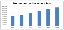
A) Line chart
B) Bar chart
C) Pie chart
D) Stacked bar chart
E) Cumulative stacked bar chart
Correct Answer:

Verified
Correct Answer:
Verified
Related Questions
Q24: Consider the following relative frequency distribution: <img
Q25: <img src="https://d2lvgg3v3hfg70.cloudfront.net/TB7521/.jpg" alt=" -What type of
Q26: Refer to the following ages (rounded to
Q27: Refer to the following distribution of commissions:
Q29: If the enrolment for this Faculty of
Q30: (i) A frequency table is a grouping
Q31: (i) Pie charts are useful for showing
Q32: The chart below can be best described
Q33: <img src="https://d2lvgg3v3hfg70.cloudfront.net/TB7521/.jpg" alt=" -Province wide, approximately
Q46: The following represent the ages of students