Multiple Choice
Which choice displays the best graphic display of the amount of nitrous oxide (NO explained by the amount of carbon monoxide (CO) emissions in million metric tons over a Ten year period in the United States? The data set is below:
A) Nitrous Oxide (NO) and Carbon Monoxide (CO)
Emissions in the U.S. ever Ten Years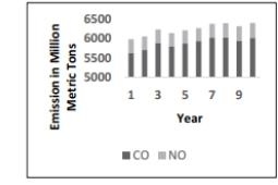
B) Nitrous Oxide (NO) and Carbon Monoxide
Emissions in the U.S. over Ten Years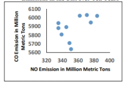
C) Nitrous Oxide (NO) and Carbon Monoxide (CO)
Emissions in the U.S. over TenYears 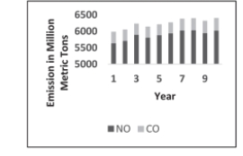
D) Nitrous Oxide (NO) and Carbon Monoxide (CO)
Emissions in the U.S. over Ten Years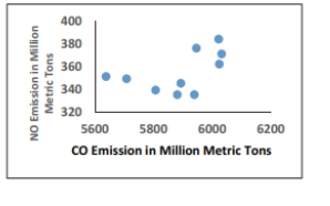
Correct Answer:

Verified
Correct Answer:
Verified
Q4: Describe the differences between a histogram and
Q5: The following data set represents Heather's
Q6: Suppose that a data set has a
Q7: The following frequency distribution analyzes the
Q8: According to USA Today, the largest categories
Q10: The frequency distribution below summarizes the
Q11: Which of the following cumulative frequency
Q12: A nurse measured the blood pressure
Q13: Graphs should be constructed in a way
Q14: The following frequency distribution represents the