Plot and Interpret the Appropriate Scatter Diagram Which Scatter Diagram Describes the Data and the Relationship, If
Multiple Choice
Plot and interpret the appropriate scatter diagram.
-The table gives the times spent watching TV and the grades of several students. Which scatter diagram describes the data and the relationship, if any?
A) 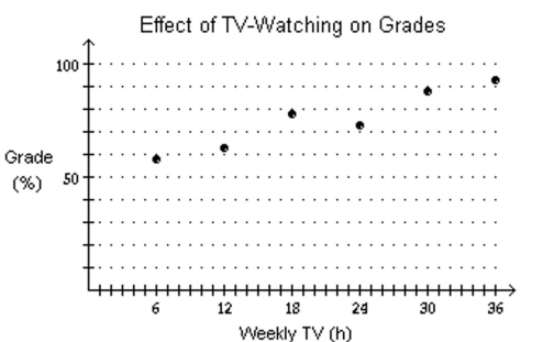
More hours spent watching TV may reduce grades.
B) 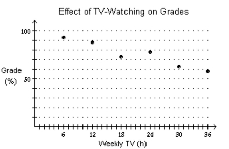
More hours spent watching TV may increase grades.
C) 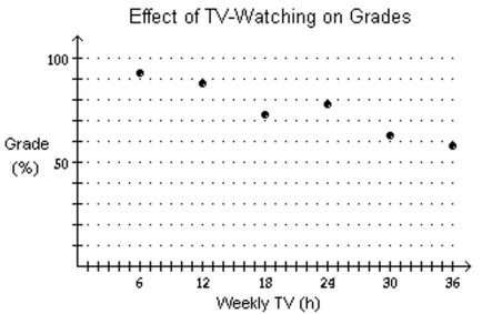
More hours spent watching TV may reduce grades.
D) none of these
Correct Answer:

Verified
Correct Answer:
Verified
Q272: Solve the problem.<br>-A flare fired from
Q273: Use a graphing utility to find
Q274: Solve.<br>- <span class="ql-formula" data-value="\text { If
Q275: Determine the domain and the range
Q276: Use a graphing utility to find
Q278: employees each year.<br>Choose the one alternative
Q279: Solve the inequality.<br>- <span class="ql-formula" data-value="x
Q280: Solve the problem.<br>-If <span class="ql-formula"
Q281: Find the real zeros, if any,
Q282: Find the zero of the linear