Multiple Choice
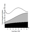
The stacked line chart shows the value of each of Danny's investments. The stacked line chart contains three regions. The uppermost unshaded region represents the value of Danny's investment in individual stocks. The center shaded region represents the value of Danny's investment in mutual funds and the bottom region in black represents the value of Danny's investment in a CD. The thickness of a region at a particular time tells you its value at that time.  Use the graph to answer the question.
-In which year was the value of Danny's investment in individual stocks the highest?
A) 1998
B) 1990
C) 1995
D) 1994
Correct Answer:

Verified
Correct Answer:
Verified
Q83: Provide an appropriate response.<br>-The frequency table
Q84: Provide an appropriate response.<br>-Consider the frequency
Q85: Provide an appropriate response.<br>-The following data
Q87: Construct the requested table. Round relative
Q89: Construct the requested table. Round relative
Q90: A nurse measured the blood pressure of
Q91: Construct the requested table. Round relative
Q92: Create a graphical display for the
Q93: Construct the requested histogram.<br>-A medical research
Q104: Answer the question.<br>-The mayor of one city