Multiple Choice
The graph below shows the approximate annual percentage growth rate in world population for the years 1960 through
2010. Data is estimated by the UN Census Bureau. 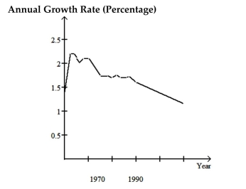 Use the graph to answer the question.
-How does world population in 1978 compare to world population in 1977?
A) It is 1.75 million greater
B) It is 1.75% less
C) It is 1.75% greater
D) It is the same
Correct Answer:

Verified
Correct Answer:
Verified
Q114: A statement is made about correlation. State
Q115: Answer the question.<br>-In a graph that displays
Q116: Solve the problem.<br>-For the study described below,
Q117: Answer the question.<br>-Which of the following quantities
Q118: The graph below shows the approximate annual
Q120: Identify the variable as either qualitative or
Q121: Determine whether the study involves selection bias,
Q122: State whether the scatter diagram shows strong
Q123: A statement is made about correlation. State
Q124: Solve the problem.<br>-For the study described below,