Plot and Interpret the Appropriate Scatter Diagram Which Scatter Diagram Describes the Data and the Relationship, If
Multiple Choice
Plot and interpret the appropriate scatter diagram.
-The table gives the times spent watching TV and the grades of several students.
Which scatter diagram describes the data and the relationship, if any?
A) 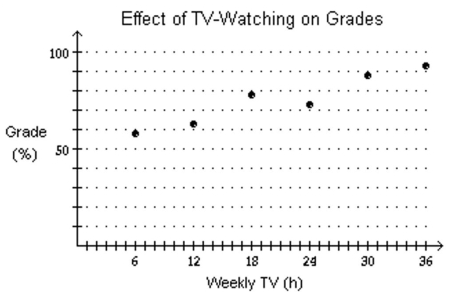
More hours spent watching TV may reduce grades. B) 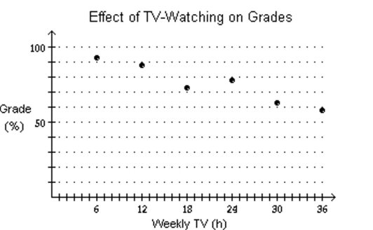
More hours spent watching TV may increase grades.
C) 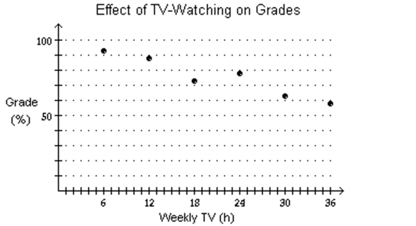
More hours spent watching TV may reduce grades.
D) none of these
Correct Answer:

Verified
Correct Answer:
Verified
Q240: Use a graphing calculator to plot
Q241: Solve the equation.<br>- <span class="ql-formula" data-value="|
Q242: Solve the problem.<br>-A survey of the
Q243: Solve the problem.<br>-A marina owner wishes
Q244: Graph the function f by starting
Q246: Solve the inequality.<br>- <span class="ql-formula" data-value="x
Q247: Use a graphing utility to find
Q248: Solve the problem.<br>-The price p (in
Q249: Use a graphing utility to find
Q250: Determine, without graphing, whether the given