Essay
The graph below shows the number of car accidents occurring in one city in each of the
years 2011 through 2016. The number of accidents dropped in 2013 after a new speed limit
was imposed. Does the graph distort the data? How would you redesign the graph to be less
misleading? Number of Car Accidents for 2011 - 2016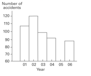
Correct Answer:

Verified
The graph distorts the data because the ...View Answer
Unlock this answer now
Get Access to more Verified Answers free of charge
Correct Answer:
Verified
View Answer
Unlock this answer now
Get Access to more Verified Answers free of charge
Q10: The weights (in pounds)of 22 members
Q11: A nurse measured the blood pressure of
Q12: A nurse measured the blood pressure of
Q13: Which explained by the amount of
Q14: The following data show the number
Q16: A nurse measured the blood pressure of
Q19: In a survey, 20 people were
Q20: The following data set represents Heather's
Q31: The linear _ coefficient denoted by r
Q57: Describe how a data point labeled as