Multiple Choice
(Figure: Interpreting Aggregate Shifts) The graph shows a(n) 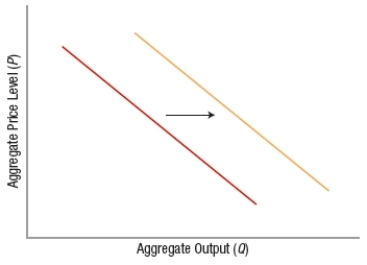
A) decrease in aggregate quantity supplied.
B) increase in aggregate quantity supplied.
C) decrease in aggregate demand.
D) increase in aggregate demand.
Correct Answer:

Verified
Correct Answer:
Verified
Related Questions
Q54: What happens if business expectations improve?<br>A) Aggregate
Q55: The long-run aggregate supply curve uses the
Q56: The long-run aggregate supply curve represents the
Q57: A(n) _ in productivity and a(n) _
Q58: An increase in net export spending will
Q60: The aggregate demand curve shows the level
Q61: If the U.S. aggregate price level rises<br>A)
Q62: If both consumers and businesses are pessimistic
Q63: If the price level is stable and
Q64: Which of these would NOT cause a