Multiple Choice
(Figure: Interpreting Market Shifts) The graph shows how supply and demand changed between the years 2011 and 2012. The market experienced 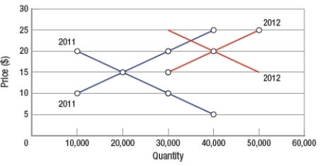
A) a decrease in demand and a decrease in supply.
B) an increase in demand and an increase in supply.
C) an increase in demand and a decrease in supply.
D) a decrease in demand and an increase in supply.
Correct Answer:

Verified
Correct Answer:
Verified
Q315: (Table) According to the data in the
Q316: The main role of a market is
Q317: In the market for cable television, fewer
Q318: If sellers expect the price of their
Q319: A change in the price of a
Q321: Luz sells cupcakes. According to market economics,
Q322: (Figure: Interpreting a Market Graph) If the
Q323: (Figure: Interpreting Supply Shifts) The shift of
Q324: On a demand curve<br>A) price is on
Q325: A market is a physical location that