Multiple Choice
(Figure: Interpreting Market Shifts) The graph shows how supply and demand changed between the years 2011 and 2012. The final effect is that 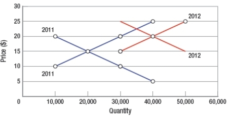
A) only price rose.
B) only quantity rose.
C) both price and quantity fell.
D) both price and quantity rose.
Correct Answer:

Verified
Correct Answer:
Verified
Related Questions
Q44: The law of supply states that as
Q45: Suppose the demand for gasoline is rising.
Q46: Which circumstance will NOT decrease the supply
Q47: An individual's valuation of a good or
Q48: A change in the quantity demanded of
Q50: When quantity demanded exceeds quantity supplied, a
Q51: Two-Buck Chuck wine is an example of
Q52: If both the supply of and the
Q53: If the price the U.S. Post Office
Q54: What happens to the supply curve when