Multiple Choice
The following figure is a contour diagram for the demand for pork as a function of the price of pork and the price of beef. Which axis corresponds to the price of beef? 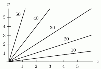
A) The x-axis
B) The y-axis
Correct Answer:

Verified
Correct Answer:
Verified
Q66: The following is a contour diagram for
Q67: The heat index tells you how hot
Q68: If <img src="https://d2lvgg3v3hfg70.cloudfront.net/TB8190/.jpg" alt="If ,
Q69: The demand, D, for gasoline at Station
Q70: The function <img src="https://d2lvgg3v3hfg70.cloudfront.net/TB8190/.jpg" alt="The function
Q72: The amount in dollars, A, spent weekly
Q73: Let <img src="https://d2lvgg3v3hfg70.cloudfront.net/TB8190/.jpg" alt="Let Determine
Q74: Your monthly payment, C(s, t), on a
Q75: A company sells two styles of jeans
Q76: Find all the critical points of <img