Multiple Choice
The population of the United States is increasing at an increasing rate. Which graph best represents this?
A) 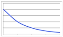
B) 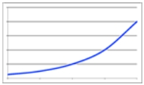
C) 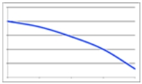
D) 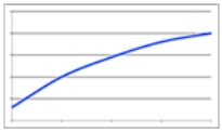
Correct Answer:

Verified
Correct Answer:
Verified
Related Questions
Q55: The following table shows the percentage of
Q56: An epidemic is spreading by an average
Q57: If you wanted to DE-EMPHASIZE a small
Q58: Annual growth rate is calculated as the
Q59: The following table shows the number of
Q61: Data that depend upon the value of
Q62: A study at ABC College found that
Q63: A _ describes how the dependent variable
Q64: The following table shows the number of
Q65: Any graph can be misleading if _