Multiple Choice
The graph shown represents the cost and revenue curves faced by a monopoly. 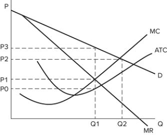 Comparing the perfectly competitive and monopoly outcomes, we can see that:
A) there is deadweight loss in the monopoly market.
B) a perfectly competitive firm would lose money in this industry.
C) a perfectly competitive firm would produce Q1 units.
D) a monopolist would charge P3 and a perfectly competitive firm would charge P1.
Correct Answer:

Verified
Correct Answer:
Verified
Q37: Economists assume maximizing efficiency over other goals:<br>A)is
Q38: The graph shown represents the cost and
Q39: Some argue that the best government response
Q40: Monopoly power in a market allows:<br>A)monopolists to
Q41: Which of the following is an example
Q43: When a monopolist chooses to produce at
Q44: For a monopolist, at the profit-maximizing level
Q45: When a government splits a natural monopoly
Q46: The monopolist chooses to produce:<br>A)where marginal cost
Q47: The graph shown represents the cost and