Multiple Choice
Use the figure to answer the following question.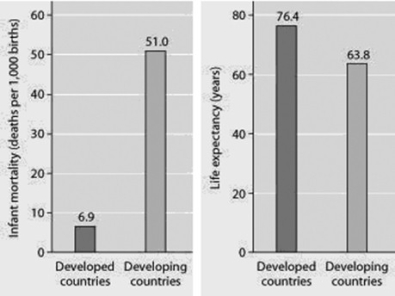
Infant mortality and life expectancy at birth in developed and developing countries (data as of 2005) .
What is a logical conclusion that can be drawn from the graphs? Developed countries have ________.
A) lower infant mortality rates and lower life expectancy than developing countries
B) higher infant mortality rates and lower life expectancy than developing countries
C) lower infant mortality rates and higher life expectancy than developing countries
D) higher infant mortality rates and higher life expectancy than developing countries
Correct Answer:

Verified
Correct Answer:
Verified
Q1: Use the survivorship curves in the figure
Q2: Use the figure to answer the
Q9: Which of the following graphs illustrates the
Q10: During exponential growth, a population always _.<br>A)
Q11: Use the graph to answer the following
Q12: Starting from a single individual, what is
Q28: The observation that members of a population
Q31: An ecologist recorded 12 white-tailed deer, Odocoileus
Q44: Natural selection involves energetic trade-offs between _.<br>A)
Q53: Based on current growth rates, Earth's human