Multiple Choice
Aggregate demand and supply curves have been widely used to analyze the performance of the macroeconomy. Figure 5-3 shows four diagrams that represent different changes in the macroeconomy. Choose the diagram that best represents the situations described in the following questions. Figure 5-3 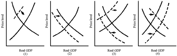
Which graph in Figure 5-3 best represents the supply-side shock of the 1970s oil crisis?
A) 1
B) 2
C) 3
D) 4
Correct Answer:

Verified
Correct Answer:
Verified
Q15: Before the Great Depression of the 1930s,
Q17: The U.S.GDP includes<br>A)wine harvested and bottled in
Q47: The Great Depression ended in the United
Q124: From 2000 to 2001, the U.S.economy's annual
Q150: What is an aggregate? How is it
Q155: During a recession, markets will<br>A)decline.<br>B)increase.<br>C)increase then decrease.<br>D)move
Q170: Trish grows oregano in her backyard to
Q178: Discuss some of the fundamental differences between
Q196: A good produced in 2009 and held
Q210: Toyota (a Japanese-based company) produces Tundras in