Multiple Choice
Aggregate demand and supply curves have been widely used to analyze the performance of the macroeconomy. Figure 5-3 shows four diagrams that represent different changes in the macroeconomy. Choose the diagram that best represents the situations described in the following questions. Figure 5-3 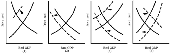
Which graph in Figure 5-3 best represents the favorable macroeconomy of the late 1990s?
A) 1
B) 2
C) 3
D) 4
Correct Answer:

Verified
Correct Answer:
Verified
Q31: Poor Asian countries may have per capita
Q53: Gross domestic product is calculated by adding
Q55: The term "stagflation" was invented in the
Q57: The primary benefit to the macroeconomy of
Q68: The end of the housing boom of
Q68: Figure 5-2<br><img src="https://d2lvgg3v3hfg70.cloudfront.net/TBX9029/.jpg" alt="Figure 5-2
Q76: The aggregate demand curve shows the quantity
Q114: Stagflation is the simultaneous occurrence of inflation
Q123: During the Great Depression of the 1930s,
Q195: Stagflation can be defined as a combination