Multiple Choice
Figure 7-9 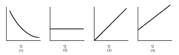
Of the graphs in Figure 7-9, which represents average fixed cost?
A) 1
B) 2
C) 3
D) 4
Correct Answer:

Verified
Correct Answer:
Verified
Q36: The rule for the optimal use of
Q47: At a given level of wheat output,
Q113: Figure 7-15 <br><img src="https://d2lvgg3v3hfg70.cloudfront.net/TBX9061/.jpg" alt="Figure 7-15
Q115: Draw a long-run average cost curve that
Q118: Figure 7-8 <br><img src="https://d2lvgg3v3hfg70.cloudfront.net/TBX9061/.jpg" alt="Figure 7-8
Q121: The table below gives data on output
Q122: Give a short concise definition for the
Q128: The optimal level of resource use comes
Q128: Figure 7-2 <img src="https://d2lvgg3v3hfg70.cloudfront.net/TB8592/.jpg" alt="Figure 7-2
Q213: Figure 7-10 <img src="https://d2lvgg3v3hfg70.cloudfront.net/TB8592/.jpg" alt="Figure 7-10