Multiple Choice
The following graphic is adapted from one in Wainer (1984) , plotting the number of private and public elementary schools (in thousands) in the U.S. between 1930 and 1970. Wainer was presenting it as a bad example, and I have made it worse. What is bad about this example?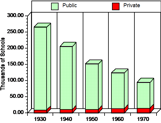
A) The three dimensional effect only makes the graph harder to read.
B) Any change in the number of private schools is difficult to see.
C) The time intervals on the abscissa are too broad.
D) a and b but not c
Correct Answer:

Verified
Correct Answer:
Verified
Q43: The real lower limit and the real
Q44: A frequency distribution<br>A) displays the average of
Q45: Assume that you have a set of
Q46: When a variable has many values, and
Q47: In a frequency distribution, the number of
Q49: The following is a frequency distribution. <br>
Q50: The next six questions are based on
Q51: In the text there was a stem-and-leaf
Q52: In the above data set, the outliers
Q53: The "real lower limit" of an interval