Multiple Choice
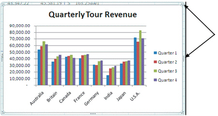 The chart shown in the figure above is a(n) ____ chart.
A) clustered column
B) exploding pie
C) scatter
D) line
Correct Answer:

Verified
Correct Answer:
Verified
Related Questions
Q11: Describe four commonly used Excel chart types.
Q56: You are a manager in the Sales
Q60: <img src="https://d2lvgg3v3hfg70.cloudfront.net/TBX9074/.jpg" alt=" As shown in
Q61: In a pie chart, you can emphasize
Q62: You are a manager in the Sales
Q64: _ indicate the scale of measure for
Q66: Describe some of the formatting changes that
Q154: _ lets you create diagram types including
Q332: Describe some of the changes that you
Q386: You can resize a chart to improve