Multiple Choice
Refer to the figure.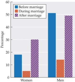 The bar graph shows the percentage of women and men born between 1943 and 1952 who said they had had more than one new sex partner at different life stages. The blue (left-most) bars show data from before marriage. The orange dotted (center) bars show data during marriage, and the purple striped (right-most) bars show data after marriage. Assuming these data reflect the general population, what conclusion can be drawn from this data?
A) Women are less likely than men to be monogamous throughout their lives.
B) Both men and women have more sex partners before their first marriage than after their first marriage.
C) Neither men nor women are virgins when they get married.
D) Men and women engage in extra-pair sex at the same rate.
E) More men than women engage in non-monogamous relationships.
Correct Answer:

Verified
Correct Answer:
Verified
Q8: Which statement accurately describes cybersex?<br>A) Only about
Q9: Elana and Miguel have been dating for
Q10: Macy's heart pounds every time she sees
Q11: Which experience is least likely during the
Q12: Which research-based strategy do the Gottmans suggest
Q14: From 1970 to 1990, public disapproval of
Q15: Arne, a student with an anxious attachment
Q16: According to research on homogamy, which couple
Q17: Marco wants to express his interest in
Q18: Outline the negative consequences of unrequited love