Essay
Refer to the figure.
Figure 1
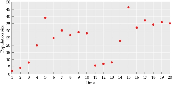 Use the data from the figure to draw a line graph (this will be referred to as Figure 2) that illustrates how population size changes over time. From time 1 to time 10, what type of logistic curve best fits this data? In your answer, address both the pattern of the line and the underlying cause of these patterns.
Correct Answer:

Verified
Figure 2
 The figure shows a logistic c...
View Answer
Unlock this answer now
Get Access to more Verified Answers free of charge
Correct Answer:
Verified
View Answer
Unlock this answer now
Get Access to more Verified Answers free of charge
Q12: When wolves were returned to Yellowstone National
Q13: The addition of excess nutrients into aquatic
Q14: At low population densities, the flocking behavior
Q15: A population that experiences delayed density dependence
Q16: A population of blowflies experiences logistic growth
Q18: Although there are approximately 10,000 cheetahs left
Q19: Refer to the figure.<br><img src="https://d2lvgg3v3hfg70.cloudfront.net/TBO1115/.jpg" alt="Refer to
Q20: In Nicholson's experiments with blowflies, population cycles
Q21: Which statement about cattle egrets in the
Q22: Which of the following is a plausible