Multiple Choice
(Figure: Understanding Monopsony Markets) The graph represents a firm that is competitive in the product market but a monopsony in the input market. Which curve represents the marginal factor cost?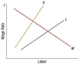
A) J
B) K
C) L
D) M
Correct Answer:

Verified
Correct Answer:
Verified
Related Questions
Q82: The dual labor market hypothesis was proposed
Q83: (Table) Based on the table, what
Q84: What is monopolistic exploitation of labor? Support
Q85: The substitution effect occurs when wages rise
Q86: If nineteen workers are each paid $10
Q88: With the rise of major incidences of
Q89: Which of these is NOT a characteristic
Q90: Which of these labor situations creates the
Q91: At what point on the individual labor
Q92: Theoretically, an increase in the minimum wage