Multiple Choice
Which of the following graphics would better illustrate how the complexity of interactions increases as more people are added to a communication situation? 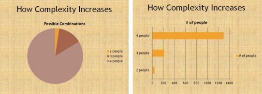
A) the pie chart
B) the bar chart
C) either of the charts will do equally well
D) neither of the charts are acceptable
Correct Answer:

Verified
Correct Answer:
Verified
Related Questions
Q12: The term for nervousness that interferes with
Q13: In terms of connecting with the audience,
Q14: Reading your slides to the audience demonstrates
Q15: Putting delivery cues on your presentation outline
Q16: Which of the following is not considered
Q18: In what kind of delivery does the
Q19: What kind of delivery allows the speaker
Q20: List three things you should not do
Q21: Notations on an outline that tell a
Q22: It's never a good idea to allow