Multiple Choice
(Figure: Demand and Average Cost Curves) Which of the following diagrams represents the demand and average cost curves of a firm in the long run, given free entry and exit?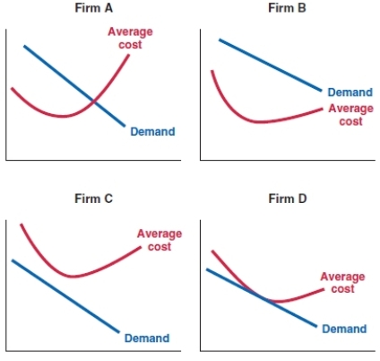
A) Firm A
B) Firm B
C) Firm C
D) Firm D
Correct Answer:

Verified
Correct Answer:
Verified
Related Questions
Q146: Suppose Naomi's yoga studio charges the market
Q147: Samuel's company is in the following
Q148: A government may want to create barriers
Q149: Free entry and exit means that in
Q150: In the short run, a seller _,
Q152: (Figure: Profit Margin 3) JoJo's company data
Q153: On a graph of a company's cost,
Q154: Janelle owns a small hotel in San
Q155: The Mile End Deli serves traditional delicatessen
Q156: (Figure: Profit Margin) What is the profit