Multiple Choice
The figure below shows the production possibilities curves (PPCs) for Viola and Davis.Which of the lines in the graph correctly represents their joint PPC?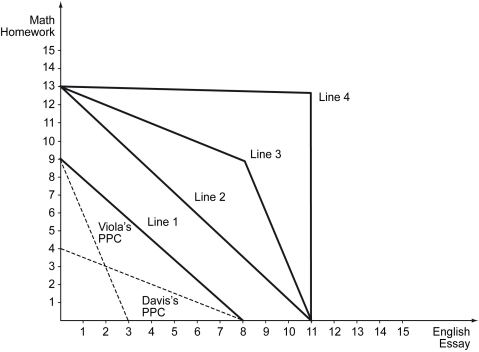
A) Line 1
B) Line 2
C) Line 3
D) Line 4
Correct Answer:

Verified
Correct Answer:
Verified
Related Questions
Q45: Which of the following statements is true?<br>A)
Q46: Scenario: With her available resources, Wendy can
Q47: The following table shows the value of
Q48: Scenario: Suppose the world price is $2
Q49: Which of the following statements is true?<br>A)
Q51: The figure below shows the domestic supply
Q52: Which of the following statements is true?<br>A)
Q53: Taxes levied on goods and services transported
Q54: Scenario: Suppose the world price is $2
Q55: Which of the following correctly identifies an