Multiple Choice
The pie chart below shows the market shares of various desktop operating systems in 2013 (http://www.netmarketshare.com/) .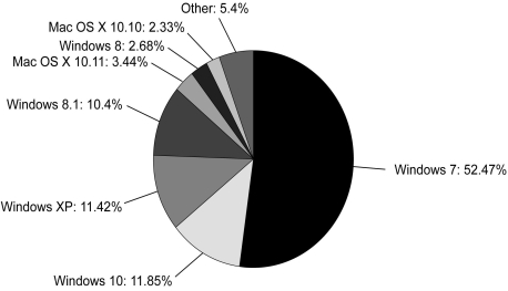
Different operating systems have different look and feel and different features from one another.Based on this information,which of the following best describes the structure of desktop OS market?
A) A monopoly
B) A monopolistic competition
C) An oligopoly with differentiated products
D) An oligopoly with homogeneous products
Correct Answer:

Verified
Correct Answer:
Verified
Q63: There are two major Internet service providers
Q64: Scenario: The fixed cost of producing 500
Q65: A fellow student claims that the federal
Q66: A duopoly in which each firm produces
Q67: A monopolistic competitor incurs losses if _.<br>A)
Q69: When does a monopolistic competitor earn positive
Q70: What does the term "undercutting" refer to?
Q71: In a long-run equilibrium in a monopolistically
Q72: Answer: The market for candy bars has
Q73: The price charged by a monopolistic competitor