Multiple Choice
Use the following to answer questions
The following graph shows the percent of families in the U.S. living below the poverty level by year.
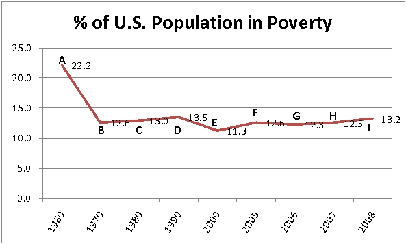
-Which slope is larger and why: From B to C, or from G to H?
A) B to C. From B to C goes up by 0.4 while G to H only goes up by 0.2.
B) B to C. There are 10 years between B and C while there is only 1 year between G and H.
C) G to H. There are 10 years between B and C while there is only 1 year between G and H.
D) G to H. The graph continues to rise from H to I.
Correct Answer:

Verified
Correct Answer:
Verified
Q104: The attendance at a band's concerts has
Q105: Use the following to answer questions <br>A
Q106: Which function's graph has a steeper slope?<br>A)
Q107: Use the function given to evaluate f(-3),
Q108: A company purchases a piece of machinery
Q110: Create an estimate of a linear model
Q111: The table shows the number of manatees
Q112: By analyzing sales figures, the accountant for
Q113: Which equation has the same slope as
Q114: Given a line segment with endpoints (7,