Short Answer
The following graph shows the population (in thousands) of two cities, City 1 and City 2.
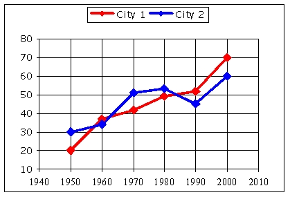
What year's census saw a decrease in city 2's population?
Correct Answer:

Verified
Correct Answer:
Verified
Q136: Determine if this set of points represents
Q137: Below is a pie chart of the
Q138: Find an equation that represents the relationship
Q139: For the equation:<br> <img src="https://d2lvgg3v3hfg70.cloudfront.net/TB9987/.jpg" alt="For the
Q140: Over what interval(s) is the function positive?<br>Write
Q142: The table shows starting salaries from a
Q143: Find the range of this function. Express
Q144: For the equation:<br> <img src="https://d2lvgg3v3hfg70.cloudfront.net/TB9987/.jpg" alt="For the
Q145: Use technology to graph the function and
Q146: A taxi company has the following fare