Short Answer
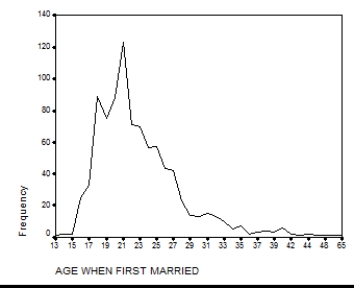
Presented below is a chart and a portion of the data for 550 respondents which were used to construct it.What is another type of graph that you can use to display this information? Construct this graph using the data below with the frequencies placed along the vertical axis.

Correct Answer:

Verified
Correct Answer:
Verified
Q1: In a _,the bars which represent the
Q2: Considering the information in the table below,what
Q4: Inspecting the title and checking the sources
Q5: Imagine one of your colleagues is constructing
Q6: Fill in the empty cells in the
Q7: Using the following information from the U.S.Census
Q8: A rate based on the total population
Q9: Consider the information in the table below.Construct
Q10: According to this table,what percentage of respondents
Q11: A graph showing the differences in frequencies