Multiple Choice
Figure 27.8 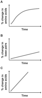
-The graphs above show percentage of change in three different molecular sequences plotted against time.Which of these molecular sequences would make a good candidate for a molecular clock?
A) Graph A,because the curve levels off over time
B) Graph B,because DNA is more important to organisms and,therefore,will give a more accurate picture of divergence
C) Graph C,because the change in sequence is the most rapid
D) Graph A or C,because changes in amino acid sequence are more likely to be neutral than changes in DNA
E) Graph B or C,because they are straight lines
Correct Answer:

Verified
Correct Answer:
Verified
Q3: Which listing of geological periods is in
Q20: Figure 27.6 <img src="https://d2lvgg3v3hfg70.cloudfront.net/TB3733/.jpg" alt="Figure 27.6
Q21: Which of the following key adaptations is
Q22: You have obtained the following data on
Q23: Figure 27.9<br> <img src="https://d2lvgg3v3hfg70.cloudfront.net/TB3734/.jpg" alt="Figure 27.9
Q24: You know that a particular stretch of
Q27: Figure 27.9 <img src="https://d2lvgg3v3hfg70.cloudfront.net/TB3733/.jpg" alt="Figure 27.9
Q28: Which of the following is an example
Q28: Which of the following are typically responsible
Q40: Some beetles and flies have antler-like structures