Multiple Choice
The following graph shows the average donation for different age groups during a fund raiser at Cloverdale Academy. Which age group pair showed the most increase? 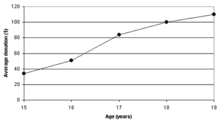
A) From the 15 to the 16 year-olds
B) From the 16 to the 17 year-olds
C) From the 17 to the 18 year-olds
D) From the 18 to the 19 year-olds
Correct Answer:

Verified
Correct Answer:
Verified
Related Questions
Q145: Here are the grades for students
Q146: Find the weighted mean for each of
Q147: Find the median for each list
Q148: Find the median for each list
Q149: Find the weighted mean for each of
Q151: During one semester, students at a local
Q152: During one semester, students at a local
Q153: Here are the grades for students
Q154: Find the weighted mean for each of
Q155: Find the weighted mean for each of