Multiple Choice
Figure 3-3
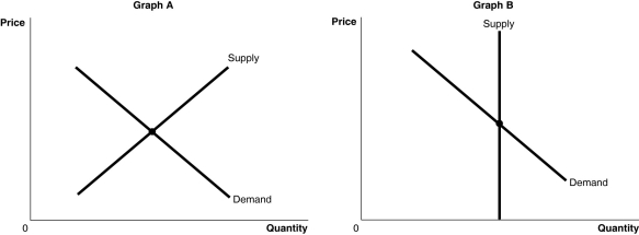
-Refer to Figure 3-3.The figure above shows the supply and demand curves for two markets: the market for an original Picasso painting and the market for designer jeans.Which graph most likely represents which market?
A) Graph B represents the market for an original Picasso painting and Graph A represents the market for designer jeans.
B) Graph A represents the market for an original Picasso painting and Graph B represents the market for designer jeans.
C) Graph A represents both the market for an original Picasso painting and designer jeans.
D) Graph B represents both the market for an original Picasso painting and designer jeans.
Correct Answer:

Verified
Correct Answer:
Verified
Q92: A decrease in the demand for soft
Q93: Elvira decreased her consumption of bananas when
Q94: Explain the differences between a change in
Q95: Figure 3-2<br> <img src="https://d2lvgg3v3hfg70.cloudfront.net/TB4193/.jpg" alt="Figure 3-2
Q96: Assume that both the demand curve and
Q98: Explain the difference between a normal good
Q99: Figure 3-1<br> <img src="https://d2lvgg3v3hfg70.cloudfront.net/TB4193/.jpg" alt="Figure 3-1
Q100: Technological advances have resulted in lower prices
Q101: Which of the following would cause an
Q102: An increase in the price of pineapples