Multiple Choice
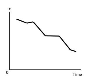
-A graph shows the average wage of various demographic groups in 2005.The kind of graph used to show these data would be a
A) scatter diagram.
B) time-series graph.
C) cross-section graph.
D) Venn-diagram.
E) fixed-year figure.
Correct Answer:

Verified
Correct Answer:
Verified
Q99: Which of the following BEST describes macroeconomics?<br>A)
Q103: To graph a relationship involving more than
Q106: <img src="https://d2lvgg3v3hfg70.cloudfront.net/TB1458/.jpg" alt=" -The graph shows
Q106: The statement that "increases in the tax
Q186: If there is a positive relationship between
Q209: An incentive is<br>A) an inducement to take
Q227: The slope<br>A) of a straight line is
Q279: <img src="https://d2lvgg3v3hfg70.cloudfront.net/TB1458/.jpg" alt=" -The above figure
Q281: Which of the following is a positive
Q287: Which of the following is a topic