Short Answer
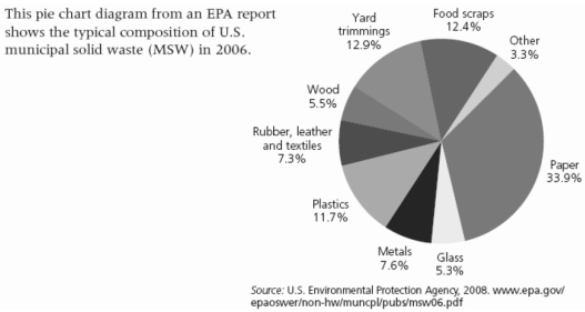
-The pie chart above shows the typical content of municipal solid waste (MSW) in the U.S. This chart represents an average amount, based on the year 2006. Think about the three largest categories in this chart, and then think about your own MSW. Are your largest categories the same as shown here? Are they different? Why? What can you do to cut down on the three largest categories of MSW that you personally generate?
Correct Answer:

Verified
Answers will vary from student...View Answer
Unlock this answer now
Get Access to more Verified Answers free of charge
Correct Answer:
Verified
View Answer
Unlock this answer now
Get Access to more Verified Answers free of charge
Q73: Source separation differs from materials-recovery facilities in
Q75: Which category most accurately describes waste such
Q76: The pricing of hazardous materials used in
Q77: In primary recycling, waste products are converted
Q79: Approximately 9 million childhood lead poisonings were
Q80: Closed-loop recycling is the same as secondary
Q80: Plastic shopping bag use is taxed in
Q81: The _ approach to recycling saves energy,
Q82: The first priority of integrated waste management
Q83: List the three key principles environmental scientists