Multiple Choice
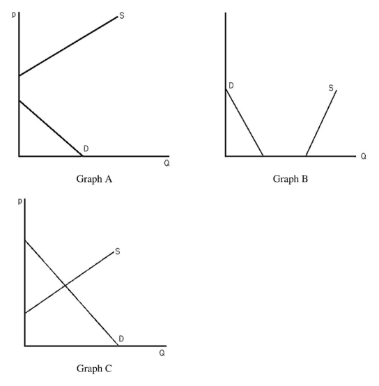
-The above figure shows three different supply-and-demand graphs.Which graph best represents the market for workers at your nearest fast-food restaurant?
A) Graph A
B) Graph B
C) Graph C
D) None of the above.
Correct Answer:

Verified
Correct Answer:
Verified
Q105: Suppose the market demand curve for pizza
Q106: Use supply-and-demand graphs to explain why parking
Q107: If the demand for oranges is written
Q108: If the price of automobiles were to
Q109: Horizontally summing different supply curves assumes<br>A) that
Q111: <img src="https://d2lvgg3v3hfg70.cloudfront.net/TB6808/.jpg" alt=" -The above figure
Q112: A drought in the Midwest will raise
Q113: Suppose a market were currently at equilibrium.A
Q114: Suppose there are 100 identical firms in
Q115: Holding all other factors constant,consumers demand more