Multiple Choice
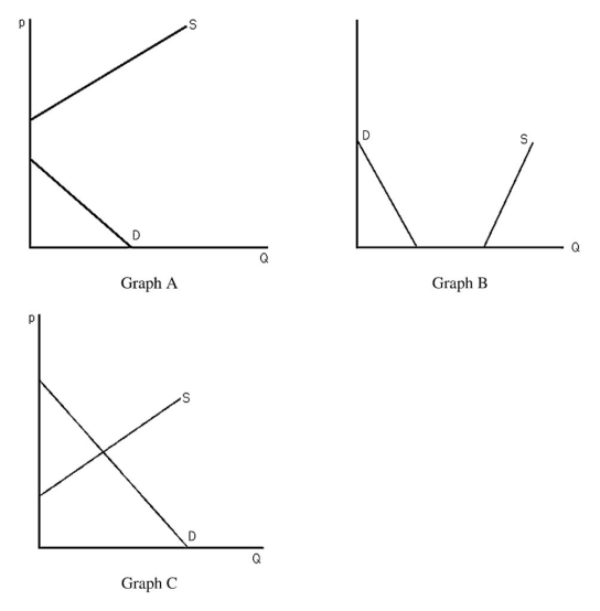
-The above figure shows three different supply-and-demand graphs.Which graph best represents the market for the air we are currently breathing?
A) Graph A
B) Graph B
C) Graph C
D) None of the above.
Correct Answer:

Verified
Correct Answer:
Verified
Q138: The supply curve is influenced by<br>A) the
Q139: Quotas are most often supported by<br>A) foreign
Q140: Explain why the equilibrium price is called
Q141: The supply-and-demand model may not be appropriate
Q142: Producer groups tend to lobby for<br>A) price
Q144: <img src="https://d2lvgg3v3hfg70.cloudfront.net/TB6808/.jpg" alt=" -The above figure
Q145: <img src="https://d2lvgg3v3hfg70.cloudfront.net/TB6808/.jpg" alt=" -The figure above
Q146: If government regulations increase the cost of
Q147: Once an equilibrium is achieved,it can persist
Q148: The expression "increase in quantity supplied" is