Multiple Choice
Figure 22-3. The left-hand graph shows a short-run aggregate-supply (SRAS) curve and two aggregate-demand (AD) curves. On the left-hand diagram, Y represents output and on the right-hand diagram, U represents the unemployment rate. 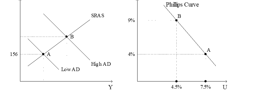
-Refer to Figure 22-3. Assume the figure charts possible outcomes for the year 2018. In 2018, the economy is at point B on the left-hand graph, which corresponds to point B on the right-hand graph. Also, point A on the left-hand graph corresponds to A on the right-hand graph. The price level in the year 2018 is
A) 155.56.
B) 159.00.
C) 163.50.
D) 170.04.
Correct Answer:

Verified
Correct Answer:
Verified
Q21: A decrease in the growth rate of
Q24: When aggregate demand shifts right along the
Q36: If people eventually adjust their inflation expectations
Q42: According to the Phillips curve,policymakers could reduce
Q60: Which of the following results in higher
Q67: Explain the connection between the vertical long-run
Q75: Suppose expected inflation and actual inflation are
Q152: The analysis of Friedman and Phelps argues
Q170: If the sacrifice ratio is 3, reducing
Q172: Which of the following would we not