Multiple Choice
Figure 3.2 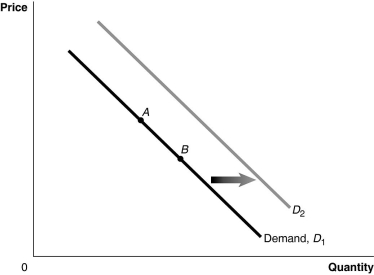 Alt text for Figure 3.2: In figure 3.2, a graph of the effect of an increase in the price of a complement on demand curve.
Long description for Figure 3.2: The x-axis is labelled, Quantity, and y-axis is labelled, Price.Curve Demand, D1, is a straight line which slopes down from the top left corner to the bottom right corner.Curve D2 follows the same slope as curve D1, but is plotted to the right.2 points, A and B, are plotted in the middle of curve D1.A right pointing arrow indicates the change from curve D1 to curve D2.
-Refer to Figure 3.2.An increase in the price of a complement would be represented by a movement from
A) A to B.
B) B to A.
C) D1 to D2.
D) D2 to D1.
Correct Answer:

Verified
Correct Answer:
Verified
Q6: If the quantity of nail polish supplied
Q8: The more substitutes there are for a
Q9: Figure 3.14 <img src="https://d2lvgg3v3hfg70.cloudfront.net/TB3061/.jpg" alt="Figure 3.14
Q15: As baby boomers age, we would expect<br>A)jobs
Q16: Figure 3.4 <img src="https://d2lvgg3v3hfg70.cloudfront.net/TB3061/.jpg" alt="Figure 3.4
Q18: Discuss the correct and incorrect economic analysis
Q55: Which of the following statements is true?<br>A)An
Q96: If the quantity of tacos demanded is
Q176: The phrase "demand has increased" means that<br>A)a
Q178: Which of the following statements is true?<br>A)An