Multiple Choice
Figure 3.2 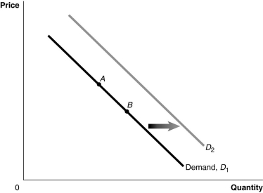 Alt text for Figure 3.2: In figure 3.2, a graph of the effect of an increase in the price of a complement on demand curve.
Long description for Figure 3.2: The x-axis is labelled, Quantity, and y-axis is labelled, Price.Curve Demand, D1, is a straight line which slopes down from the top left corner to the bottom right corner.Curve D2 follows the same slope as curve D1, but is plotted to the right.2 points, A and B, are plotted in the middle of curve D1.A right pointing arrow indicates the change from curve D1 to curve D2.
-Refer to Figure 3.2.If the product represented is a normal good, an increase in income would be represented by a movement from
A) A to B.
B) B to A.
C) D1 to D2.
D) D2 to D1.
Correct Answer:

Verified
Correct Answer:
Verified
Q34: At a product's equilibrium price<br>A)anyone who needs
Q162: During the recovery from the recession of
Q163: Figure 3.12 <img src="https://d2lvgg3v3hfg70.cloudfront.net/TB3061/.jpg" alt="Figure 3.12
Q165: Hurricane Arthur interrupted shipments of crude oil
Q169: Lobster is considered a<br>A)both a normal and
Q170: Currently, China buys more than 40% of
Q171: When all else equal, as the price
Q191: Would a change in the price of
Q203: As the number of firms in a
Q236: An article in the Wall Street Journal