Multiple Choice
Figure 3.5 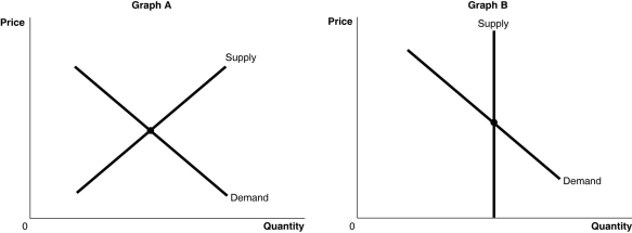 Alt text for Figure 3.5a: In figure 3.5a, a graph of intersecting supply and demand curves representing the markets for original Picasso paintings and designer jeans.
Long description for Figure 3.5a: The x-axis is labelled, Quantity, and the y-axis is labelled, Price.Curve Supply is a straight line which slopes up from the bottom left corner to the top right corner.Curve Demand is a straight line which slopes down from the top left corner to the bottom right corner.The 2 curves intersect at their respective midpoints.
Alt text for Figure 3.5b: In figure 3.5b, a graph of intersecting supply and demand curves represents one of the two markets for original Picasso paintings and designer jeans.
Long description for Figure 3.5b: The x-axis is labelled, Quantity, and the y-axis is labelled, Price.Curve Demand is a straight line which slopes down from the top left corner to the bottom right corner.Curve Supply is a straight, vertical line beginning from approximate midpoint of the x axis.The 2 curves intersect at their respective midpoints.
-Refer to Figure 3.5.The figure above shows the supply and demand curves for two markets: the market for original Picasso paintings and the market for designer jeans.Which graph most likely represents which market?
A) Graph B represents the market for original Picasso paintings and Graph A represents the market for designer jeans.
B) Graph A represents the market for original Picasso paintings and Graph B represents the market for designer jeans.
C) Graph A represents both the market for original Picasso paintings and designer jeans.
D) Graph B represents both the market for original Picasso paintings and designer jeans.
Correct Answer:

Verified
Correct Answer:
Verified
Q12: A positive technological change will cause the
Q32: A surplus is defined as the situation
Q42: If in the market for apples the
Q79: If a decrease in income leads to
Q113: Which of the following describes a characteristic
Q237: In response to a surplus the market
Q297: All else equal, a successful marketing campaign
Q298: Following the successful launch of Red Bull
Q299: Figure 3.3 <img src="https://d2lvgg3v3hfg70.cloudfront.net/TB3061/.jpg" alt="Figure 3.3
Q300: If in the market for blueberries, the