Multiple Choice
Figure 3.7 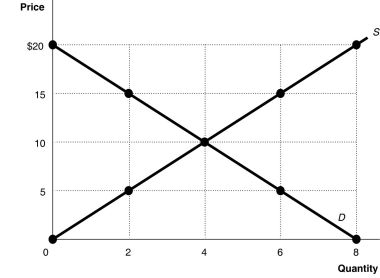 Alt text for Figure 3.7: In figure 3.7, a graph plotting intersecting supply and demand curves illustrates surplus and shortage in a market, along with an equilibrium.
Long description for Figure 3.7: The x-axis is labelled, Quantity, and is marked from 0 to 8 in increments of 2.The y-axis is labelled, Price, and is marked from 0 to 20 dollars in increments of 5.Curve D is a straight line which slopes down from the top left corner to the bottom right corner.Curve S is a straight line which begins in the bottom left corner and slopes up to the top right corner.The equilibrium of the 2 curves is marked at (4,10) .2 points plotted on the demand curve to the left of the equilibrium are (0,20) and (2,15) .2 points plotted on the demand curve to the right of the equilibrium are (6,5) and (8,0) .2 points plotted on the supply curve to the right of the equilibrium are (6,15) and (8,20) .2 points plotted on the supply curve to the left of the equilibrium are (2,5) and (0,0) .
-Refer to Figure 3.7.At a price of $15,
A) there would be a surplus of 4 units.
B) there would be a shortage of 2 units.
C) there would be a surplus of 6 units.
D) there would be a shortage of 4 units.
Correct Answer:

Verified
Correct Answer:
Verified
Q49: How does the increasing use of MP3
Q71: Assume that the hourly price for the
Q143: If the demand curve for a product
Q151: Which of the following would cause a
Q177: Figure 3.14 <img src="https://d2lvgg3v3hfg70.cloudfront.net/TB3061/.jpg" alt="Figure 3.14
Q180: Studies have shown that drinking one glass
Q182: How does the increasing use of digital
Q185: Nearly a quarter of China's 1.3 billion
Q239: In each of the following situations, list
Q472: Figure 3-1 <img src="https://d2lvgg3v3hfg70.cloudfront.net/TB7397/.jpg" alt="Figure 3-1