Multiple Choice
Figure 3.11 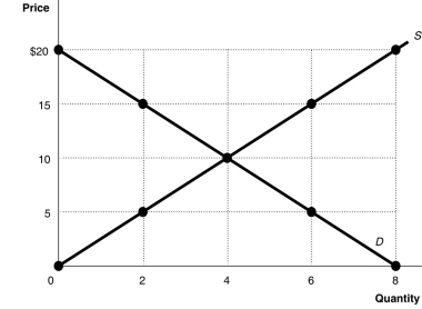 Alt text for Figure 3.11: In figure 3.11, a graph plotting intersecting supply and demand curves illustrates how supply and demand function in competitive markets.
Long description for Figure 3.11: The x-axis is labelled, Quantity, and is marked from 0 to 8 in increments of 2.The y-axis is labelled, Price, and is marked from 0 to 20 dollars in increments of 5.Curve D is a straight line which slopes down from the top left corner to the bottom right corner.Curve S is a straight line which begins in the bottom left corner and slopes up to the top right corner.The equilibrium of the 2 curves is marked at (4,10) .2 points plotted on the demand curve to the left of the equilibrium are (0,20) and (2,15) .2 points plotted on the demand curve to the right of the equilibrium are (6,5) and (8,0) .2 points plotted on the supply curve to the right of the equilibrium are (6,15) and (8,20) .2 points plotted on the supply curve to the left of the equilibrium are (2,5) and (0,0) .
-Refer to Figure 3.11.At a price of $5,
A) there would be a surplus of 4 units.
B) there would be a scarcity of 4 units.
C) there would be a shortage of 6 units.
D) there would be a shortage of 4 units.
Correct Answer:

Verified
Correct Answer:
Verified
Q12: Assume that the hourly price for the
Q27: If the number of firms producing mouthwash
Q134: The Internet has created a new category
Q191: Studies have shown links between calcium consumption
Q201: If, for a product, the quantity supplied
Q250: Many universities offer student bus passes (often
Q252: Hurricane Juan hit Halifax in 2003.The storm
Q253: Prices of commercial airline tickets have fallen
Q259: Figure 3.7 <img src="https://d2lvgg3v3hfg70.cloudfront.net/TB3061/.jpg" alt="Figure 3.7
Q260: Several studies have shown promising links between