Multiple Choice
Figure 3.11 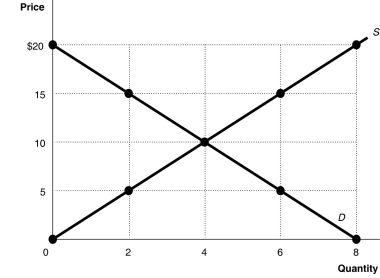 Alt text for Figure 3.11: In figure 3.11, a graph plotting intersecting supply and demand curves illustrates how supply and demand function in competitive markets.
Long description for Figure 3.11: The x-axis is labelled, Quantity, and is marked from 0 to 8 in increments of 2.The y-axis is labelled, Price, and is marked from 0 to 20 dollars in increments of 5.Curve D is a straight line which slopes down from the top left corner to the bottom right corner.Curve S is a straight line which begins in the bottom left corner and slopes up to the top right corner.The equilibrium of the 2 curves is marked at (4,10) .2 points plotted on the demand curve to the left of the equilibrium are (0,20) and (2,15) .2 points plotted on the demand curve to the right of the equilibrium are (6,5) and (8,0) .2 points plotted on the supply curve to the right of the equilibrium are (6,15) and (8,20) .2 points plotted on the supply curve to the left of the equilibrium are (2,5) and (0,0) .
-Refer to Figure 3.11.At a price of $15, the quantity sold
A) is 2 units.
B) is 4 units.
C) is 6 units.
D) cannot be determined.
Correct Answer:

Verified
Correct Answer:
Verified
Q36: One would speak of a movement along
Q59: When deciding on which new products to
Q214: "Because Coke and Pepsi are substitutes,a decrease
Q274: Figure 3.13 <img src="https://d2lvgg3v3hfg70.cloudfront.net/TB3061/.jpg" alt="Figure 3.13
Q276: Technological advancements have led to lower prices
Q277: At auction experts expect a Jacques Plante
Q278: In recent years the cost of producing
Q281: Table 3.5 <img src="https://d2lvgg3v3hfg70.cloudfront.net/TB3061/.jpg" alt="Table 3.5
Q282: Suppose that when the price of hamburgers
Q284: Figure 3.16 <img src="https://d2lvgg3v3hfg70.cloudfront.net/TB3061/.jpg" alt="Figure 3.16